Tables of Values, Graphing Scatter Plots, Describing Relationships and Making Predictions
Although generally not the urgent student learning need in most classrooms, working with two-variable linear and non-linear relationships could also be made more visual to help students better understand some of the important pieces that will help with linear equations and beyond. As mentioned in posts previously shared in this visualizing mathematics series, I want students to increase their spatial reasoning skills and better connect concrete representations of math to those that are more abstract.
In order to make this visualization relevant for my own students, I created these videos using the data from the Candle Burning 3 Act Math Task:
[threeactshortcode the_query=”post_type=realworldmath&p=11282″]
The video can now be used as a pretty good consolidation to summarize student understanding after completing the task or later in the unit as you approach a summative evaluation.
This post will summarize three short videos chunked into the following:
- Creating Tables of Values and Graph Scatter Plots to Model Two-Variable Relationships
- Describing and Classifying Two-Variable Linear and Non-Linear Relationships
- Making Predictions on Scatter Plots Using Interpolation and Extrapolation
Creating Tables of Values and Graph Scatter Plots to Model Two-Variable Relationships
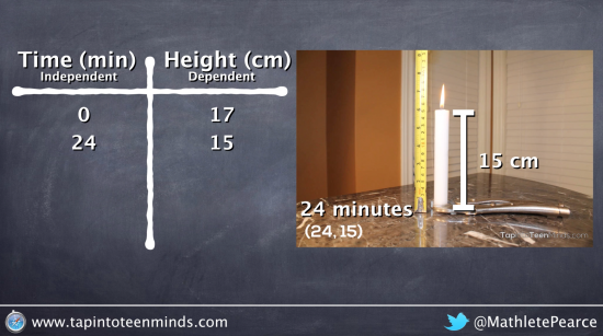
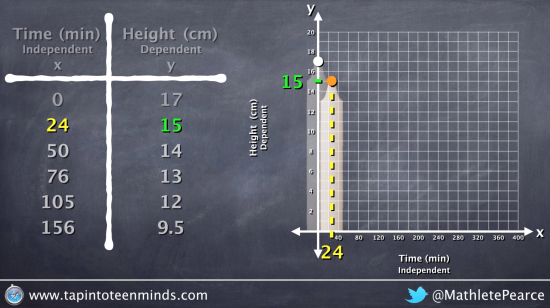
In this video, we will recall the video from Candle’s Burning 3 Act Math Task where we watch a candle burning until it burns out completely. Here, we introduce the idea of independent and dependent variables and show where they go in a table of values and on the graph of a scatter plot. We then show how to take the data points collected from the video are organized in the table of values and how we plot them on the graph:
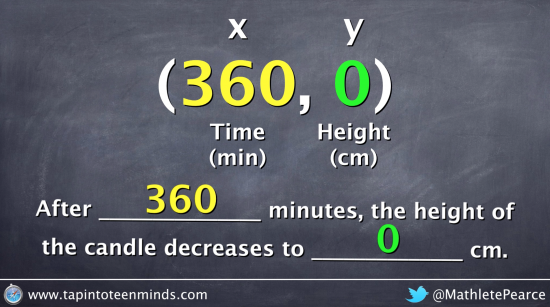
We also show how to make a prediction using the line of best fit as well as interpret the values from a data point/coordinate/ordered pair:
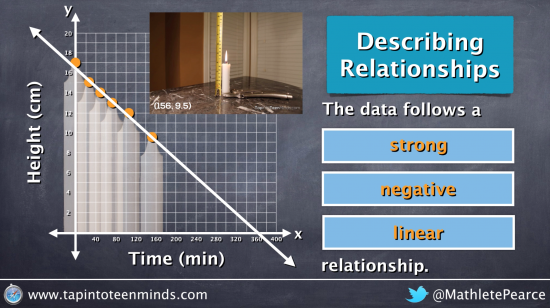
Describing and Classifying Two-Variable Linear and Non-Linear Relationships
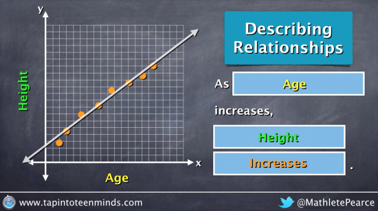
In the second video, we begin discussing how to describe and classify relationships:
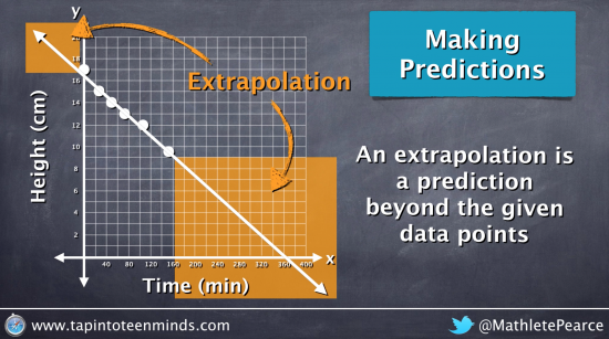
Making Predictions on Scatter Plots Using Interpolation and Extrapolation
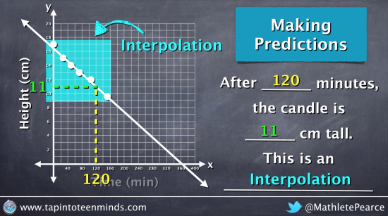
In the last visualization video, we look at making predictions on the scatter plot using interpolation and extrapolation. After discussing that interpolations are predictions within the range of given data points and extrapolations are predictions outside of that range, we make this visual for students to see:
We also make a couple predictions to ensure students are making the connection:
Do you have any ideas we can add to make understanding this concept even better? Please comment below!
WANT TO LEARN HOW TO TEACH THROUGH TASK?
Share With Your Learning Community:

About Kyle Pearce
I’m Kyle Pearce and I am a former high school math teacher. I’m now the K-12 Mathematics Consultant with the Greater Essex County District School Board, where I uncover creative ways to spark curiosity and fuel sense making in mathematics. Read more.
Read More From The Blog

